Making a busy programme easy to navigate
Editorial design · Graphic design
About the project
Client: ONS
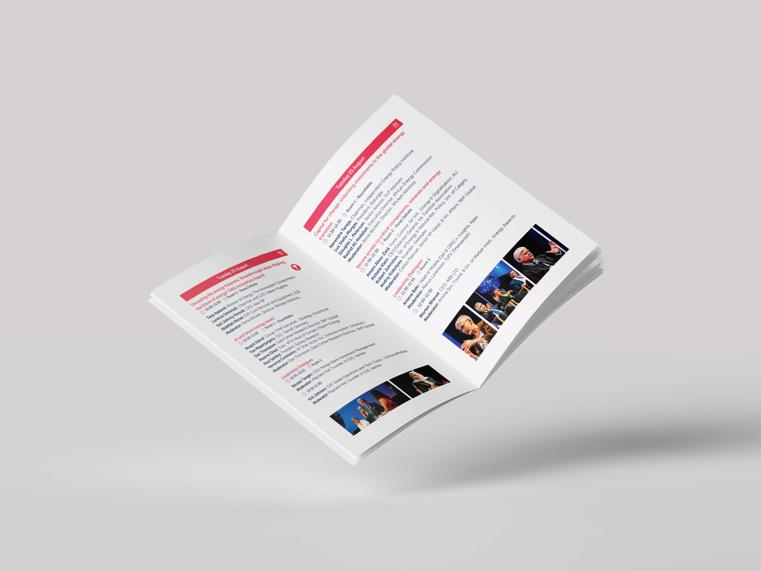
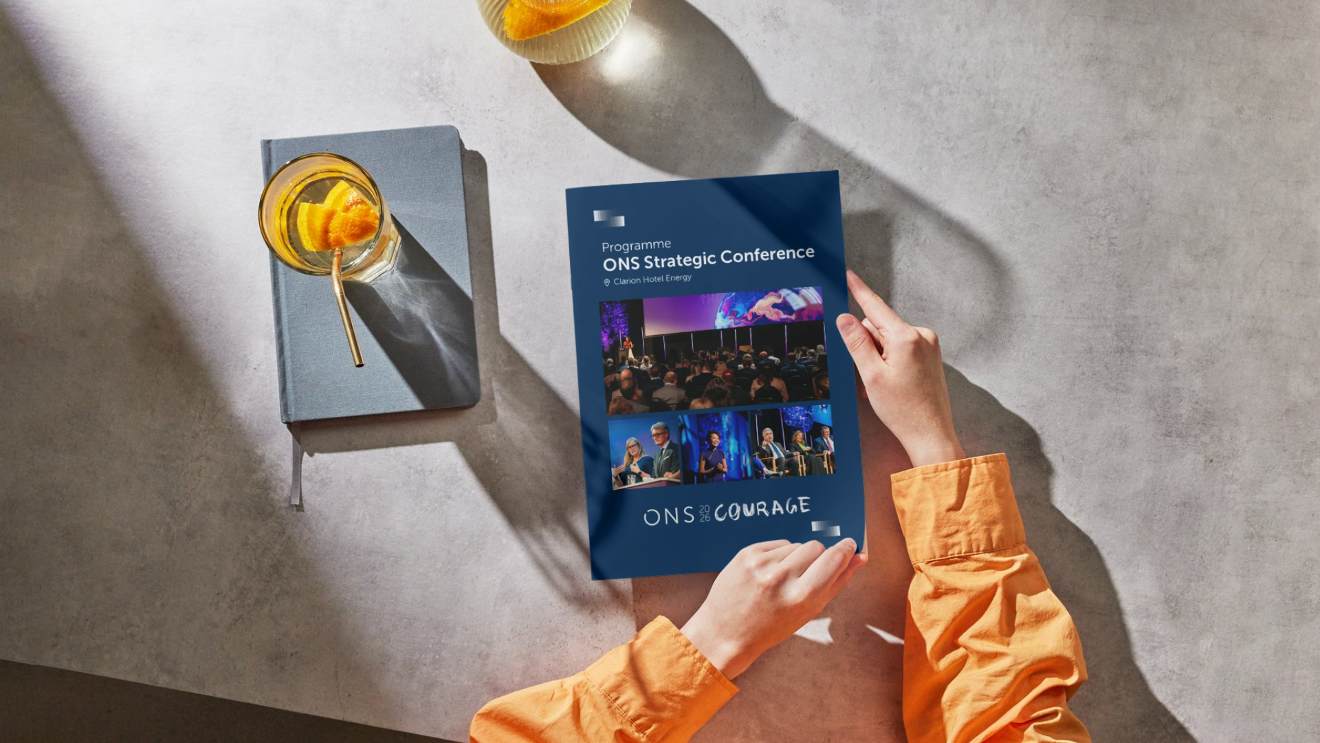
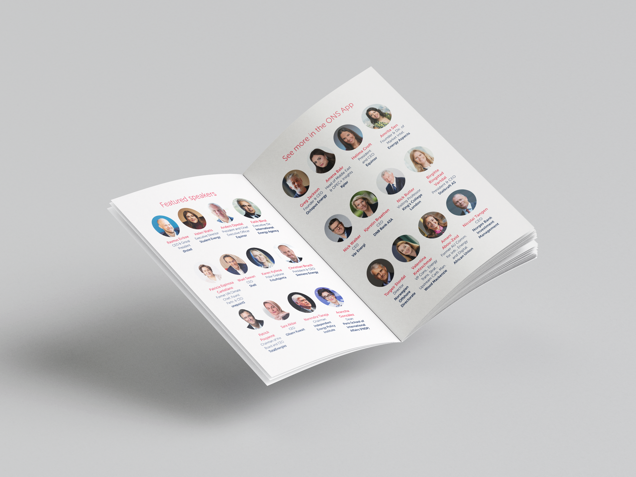
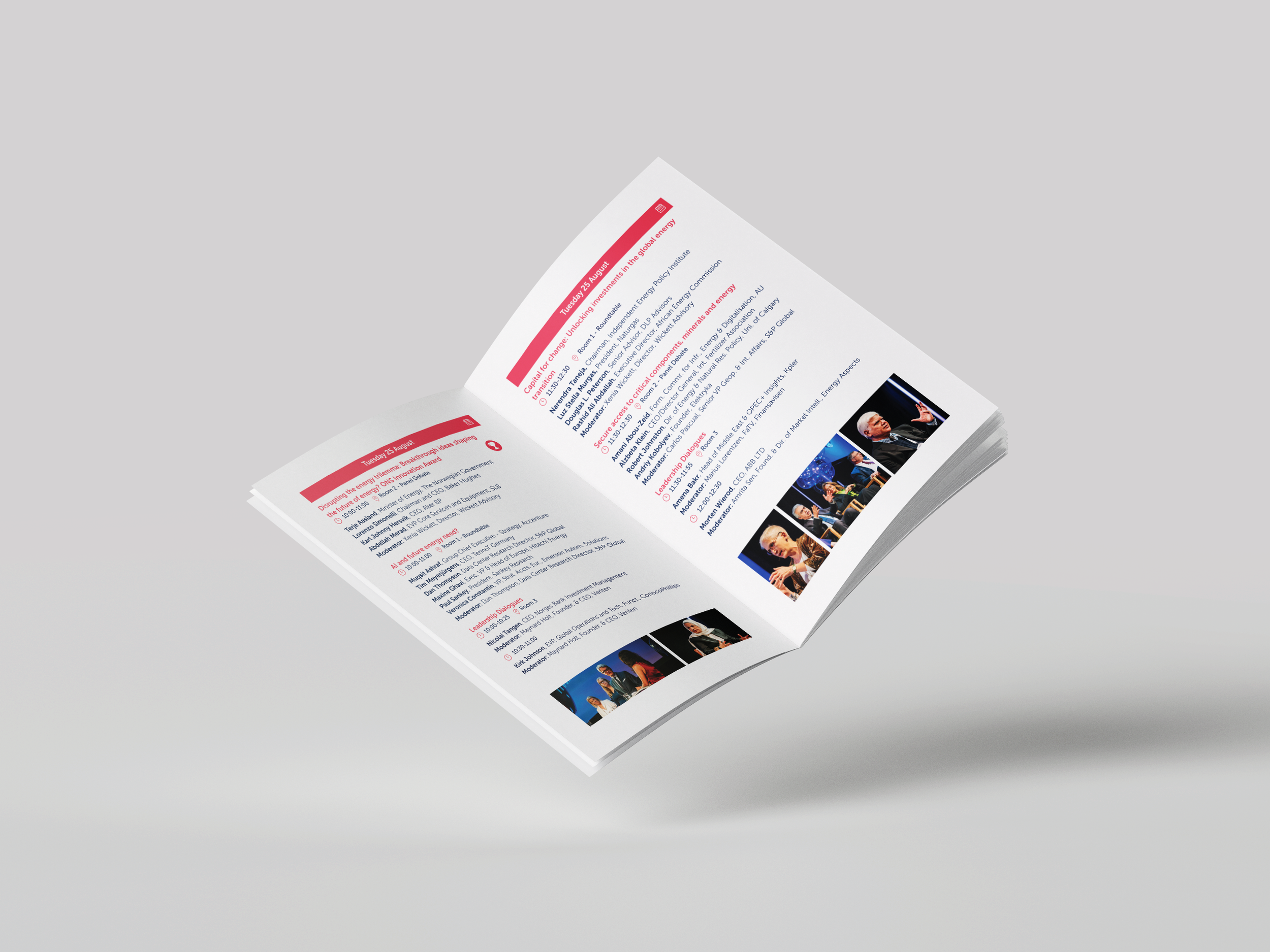
I designed the Strategic Conference Programme: a compact brochure bringing together three full days of conference sessions. With a large number of sessions taking place each day, often at the same time, the challenge was to make a lot of information feel clear, accessible and easy to navigate, both on screen and in print.
Approach
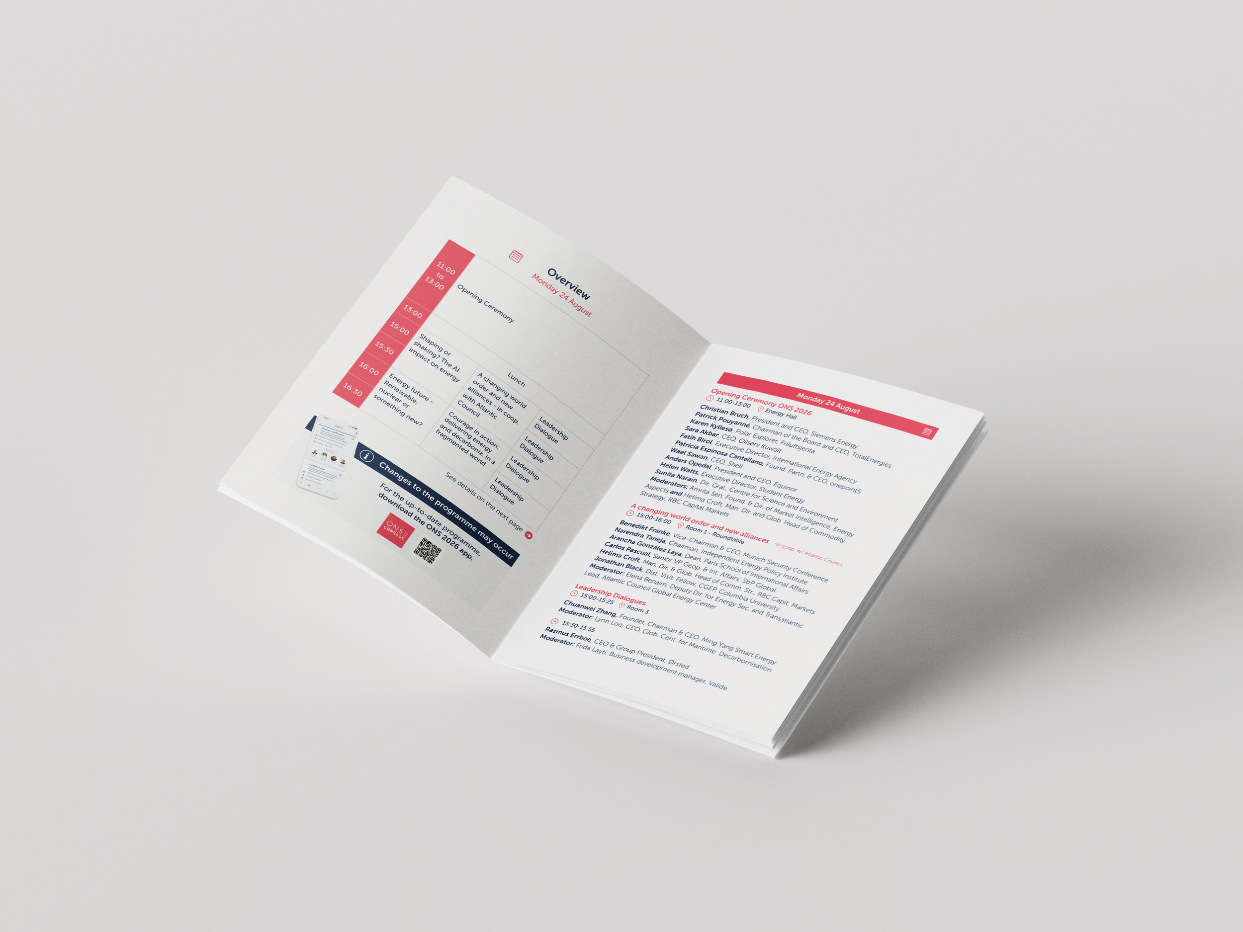
I introduced a new concept to the programme: the overview.
Rather than taking visitors straight into a detailed list of sessions, each day now begins with a quick visual summary of the programme. This gives visitors a sense of the day at a glance before they dive into the individual sessions.
The overview makes it easier to see what is happening, identify overlaps and decide which sessions to attend when several are taking place simultaneously.
I also increased the font size compared with previous years, prioritising readability and making the programme more comfortable to use in a busy conference environment.
The design was developed with both visual clarity and practical use in mind — creating a programme that works as a communication piece, but also as a useful tool visitors can refer to throughout the event.
The result
Result
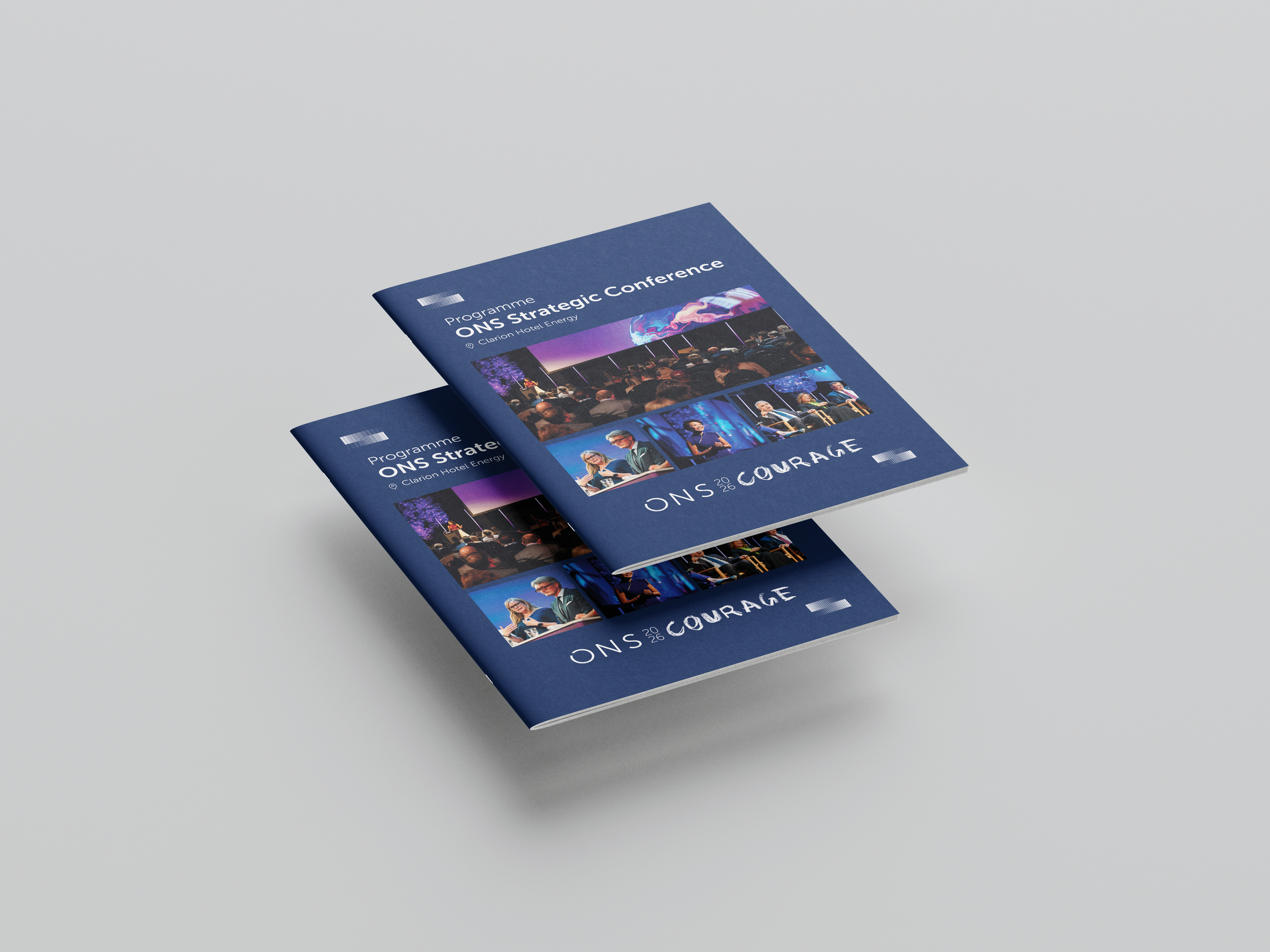
The result was a clearer and more user-friendly conference programme, helping visitors quickly understand the structure of each day and make decisions about where to go next.
The new overview added another layer of navigation without adding complexity, while the larger typography improved readability throughout.
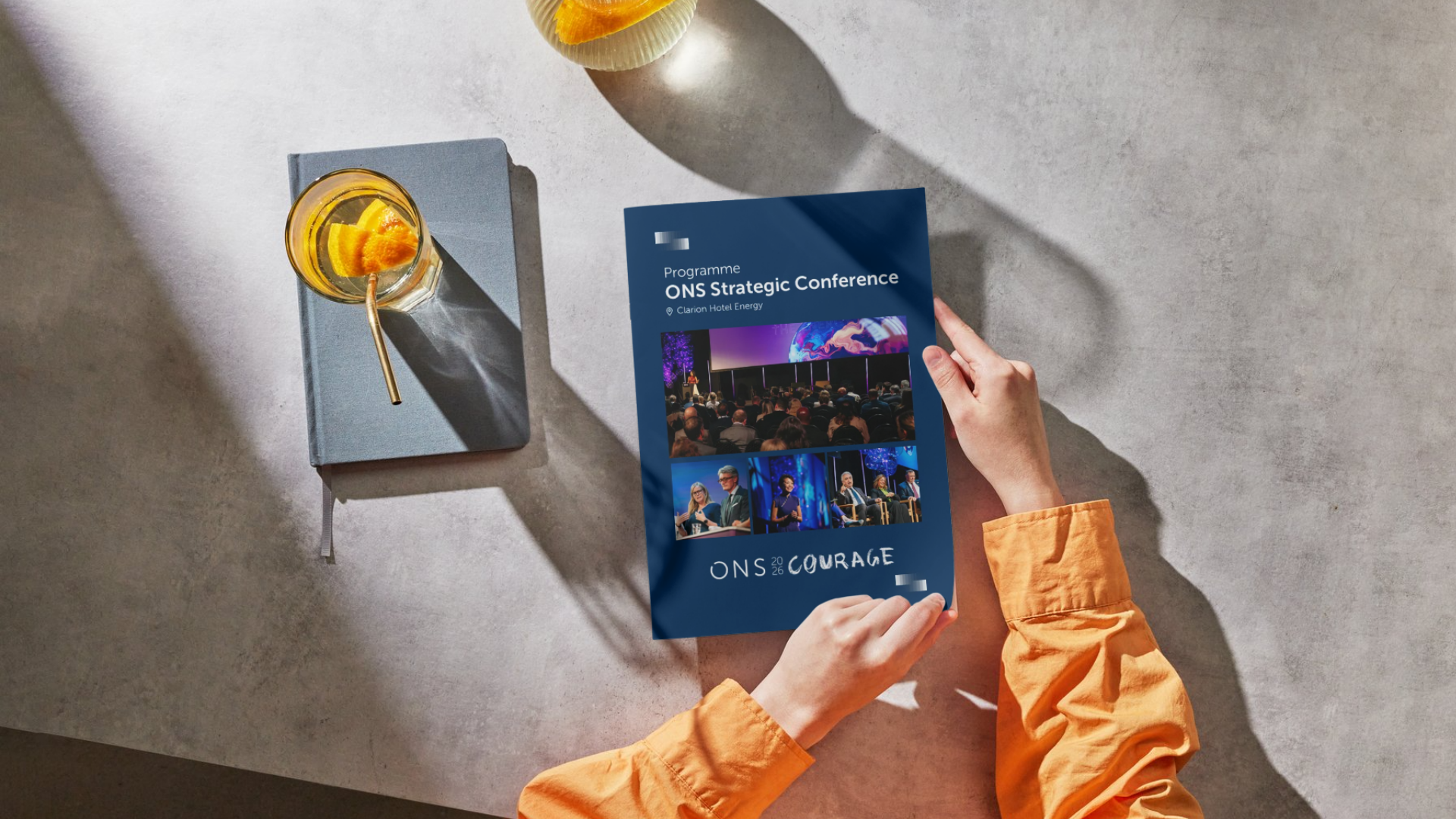
The programme was made available digitally through ons.no and distributed as a physical brochure to visitors during ONS 2026.