
Podcast branding
Solsagt for Solenergiklyngen


Client: Solenergiklyngen
While working with the The Solar Energy Cluster on a full-year retainer, one of the projects we collaborated on was the development of the visual identity of their brand new podcast: Solsagt. The show includes interviews and conversations with industry experts and it is a dynamic and informative podcast.
The challenge: Design a full visual identity for the podcast, including its own color universe, while keeping a visual connection to the main brand. The project also included the creation of editable templates to present speakers in social media ahead of each episode.
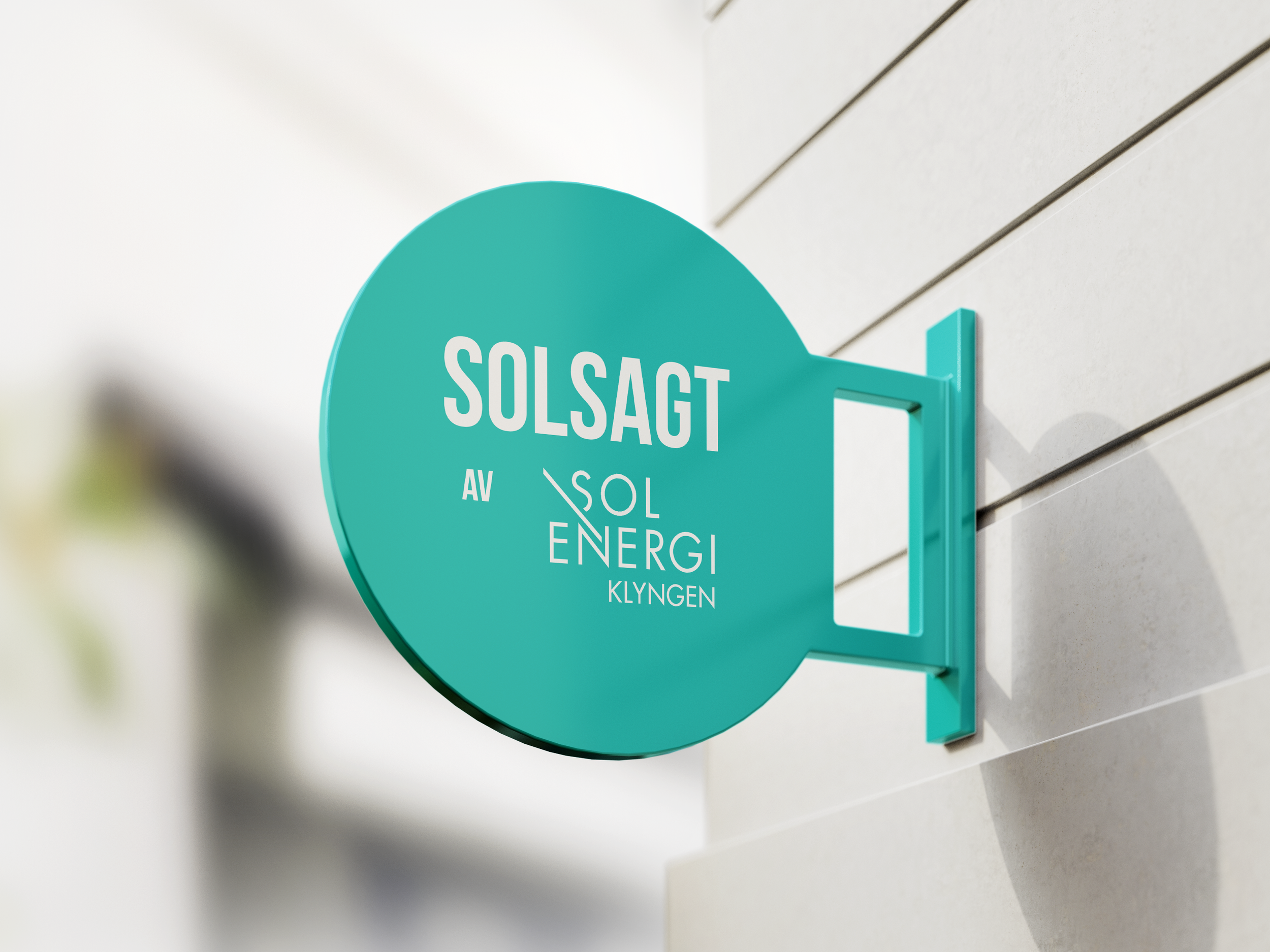
The approach: Firstly, we created three alternative color palettes and put them to the test - finally choosing an aquamarine green and an off-white tone to be the main colors for the podcast identity materials and logo. As a product of the brand, the podcast got its new logo with a reference to the brand’s main logo and a simple visual profile in line with the brand’s visual style.
The result: From the inception of a distinctive logo to the careful selection of colors and typography, every element aligns with the company's commitment to sustainable energy and the climate transition. The choice of colors adsd a modern twist and connect to the main business while still providing the podcast with its own distinctive identity.